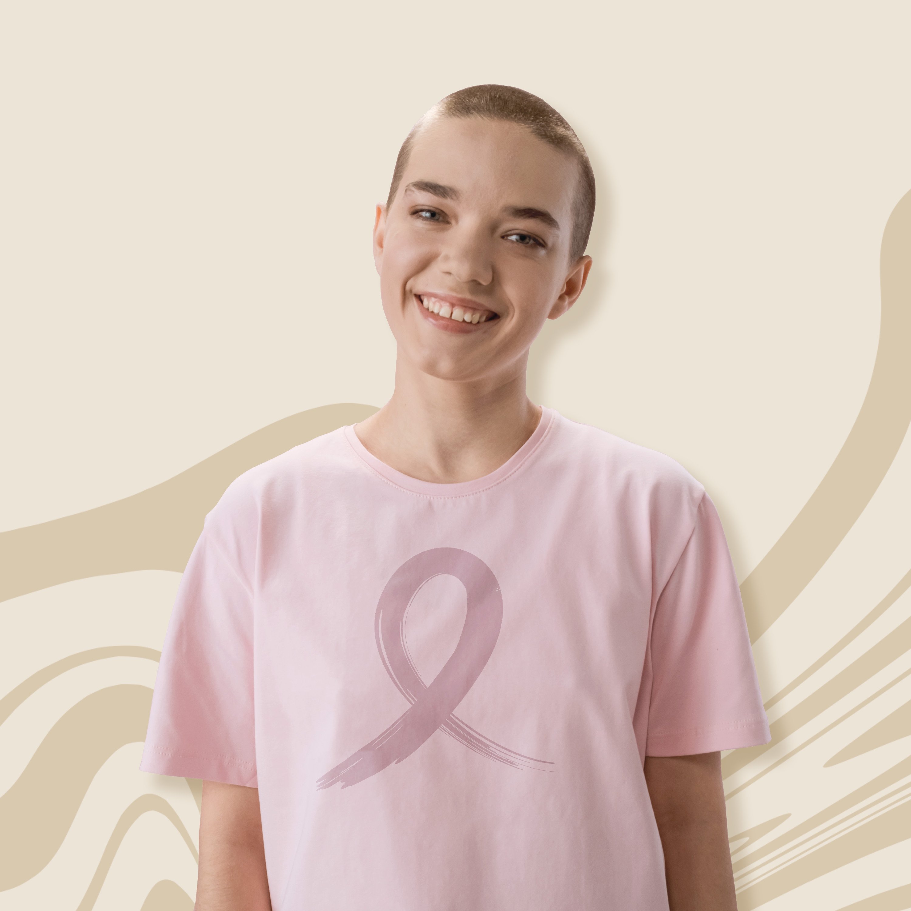
Decorated uniforms and spirit wear are a sign that you mean business when it comes to team sports. You’re playing to win, and cheering on your players. You love your team, whatever the age or level of play, and you’re proud to show it. You need a logo that says Score!, not a runner-up. With SquadLocker on your team, you can get pro-quality logo design that scores every time -- for FREE!
What difference does it make?
You’d know their logos anywhere:
- Starbucks
- Coca-Cola
- McDonald’s
- FedEx
- Nike
- Apple
- Olympics
- Pepsi
- Pro sports teams
You instantly recognize these brands because their companies spend millions on logo development and marketing. The logo designs are memorable – distinctive even when they don’t mention the brand by name – because they send a simple, clear visual message. Nike paid just $35 to the designer who created their enduring logo, but that was way back in 1971. Recently, British Petroleum paid $211 million for their logo. (Yep, you read that right.) At SquadLocker, you pay $0.
“The right logo says everything without saying a word,” notes an article in Forbes. “It connotes feelings of honor, trust, pride, excellence and integrity.” Your brand creates a bond among players and fans, and it makes an instant impression wherever it goes. Uniforms and spirit apparel that look better will sell better, earning your team more money and promoting your team more often, every time an item is worn.
“But you’re changing our logo!”
Most of our customers have an existing logo, but often it is not quite the right tool for the job. We can always use it as is, but you may not get the quality result you hoped for. We know you want your branding to be perfect (and we do, too). Above all, we want to get it exactly right for you the first time, so everyone is thrilled to receive their gear and start showing it off. That’s why we’re always happy to help, and it’s always free.
We get it. Your logo is unique. It represents your school or team’s brand, your personality, your heritage. Sometimes customers worry that making changes will erase those special traits. Rest assured our goal is only to tweak your artwork so that it produces winning decoration.
SquadLocker takes you from poor to Score!
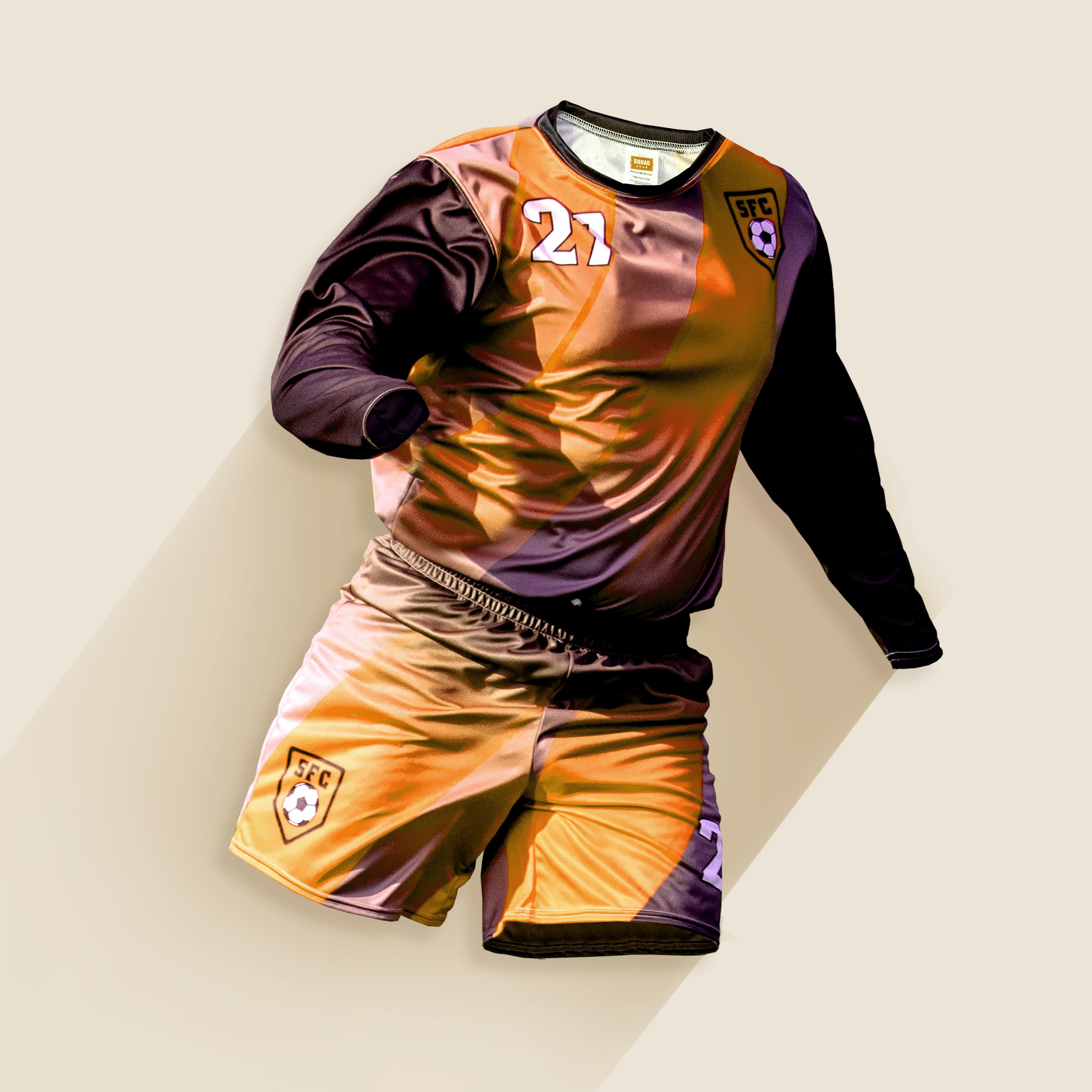
We work in authentic, on-the-field player gear for all play levels from kids to pro, along with all the spirit wear options your fans could want – top-quality products from the biggest names in sports apparel. Branding those items with your logo is essential. But a logo that looks impressive on an outdoor sign or printed on paper may not work so well, as is, for decorating uniforms and other apparel. You want a logo that will produce perfect results for your intended garment/decorating process.
What could be holding your artwork back? Let’s look at five common issues that make logos unsuitable for decoration, then we’ll take a look at some great logos.
Five common issues in logo design for apparel
1. Too many gradients or textures
- Photoshop-like textures (drop shadows, gradients, feathering)
- Photo realism detail that will need to be redrawn to make suitable for print
- Full background that blurs into the actual artwork, making it difficult to edit/redraw from – our designer would need to start from scratch
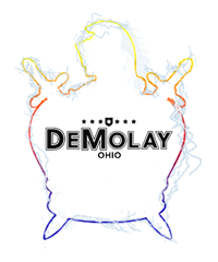
- Black logo in the middle is fine
- Textures around it are not reproducible for decoration due to the feathering/blur effect
- Drop shadows, transparencies
2. Low resolution or actual photograph
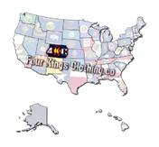
- Very pixelated
- Photorealistic, so we would have to redraw it from scratch
- Some detail is so small and pixelated we cannot make out exactly what it is (for example, details inside US states)
- Not suitable for embroidery due to the fine/tiny detail
- Illegible – cannot even make out what it is
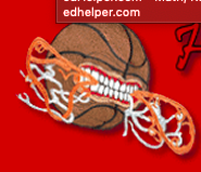
3. Too complex
- Photorealistic, so we would have to redraw it from scratch
- Part illustration that we would have to redraw/replicate to make it suitable for print
- Large surface area contributes to “sticker feel”
- Not a great candidate for embroidery
4. Too much surface area
Logos with too much surface area can look like a “sticker.” Surface area is how much of the overall dimension the logo occupies. For example, a circle filled with the color blue would take up a lot of space at 8” wide by 8” tall, but instead of filling that circle with the color blue what if we just made it an outline? Your logo would be the same size but now circle that is just an outline would take up very little surface area – making a much stronger impact.

Here’s an example:
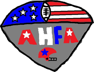
- Large shields can lead to a lot of surface
- If this was going on a grey shirt we would recommend removing the grey for printing, allowing for more negative space (the grey shirt itself) to show through
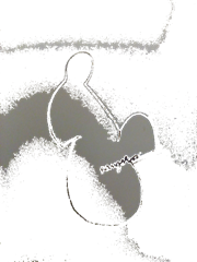
5. Tiny detailing
Intricate detailing can look wonderful using standard printing or sublimation, but it gets lost when you’re decorating with embroidery. The example below is also a circle, which could give it the “sticker” look when printed.

Problems solved -- poor no more!
The logos below work well as they don’t consume too much surface area, they are not pixelated or contain any photographic elements, drop shadows, gradients, etc.
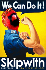
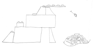
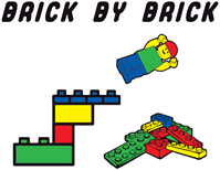
As we see below, this customer didn’t have a logo, but they had an idea. Our design team transformed it into a colorful rendition perfect for decoration (and lots of other uses).
But what if you don’t have any logo, even a sketch, to use as a starting point? No sweat, our SquadLocker experts will help you create a winning design that scores big right from the start. And it’s still free.


.jpg)